Type is the physical representation of speech, it has developed over thousands of years and changed through people and cultures.
There isn't specific time that type was made, cavemen had images and mark makings to communicate but as people were spreading out into the world language and type changed and developed. This is very apparent in cases like oriental type and language.
"All that is necessary for any language to exist is an agreement amongst a group of people that one thing will stand for another"
The Greek alphabet was the original alphabet that the english language use. The Gutenberg press was invented in the 1450's which meant type was a lot more accessible. It was faster at producing pieces of type. The Elementary Education Act which was introduced in 1870 by William Foster meant that children for 5-12 had to go to school meaning that type was needed. This impacted the type world a lot because a lot more people were reading and learning.
Helvetica was then designed in 1957 by Max Miedinge which was the first typeface designed which was designed for function over form. It had to be readable and legible before it's style. This was a revolutionary design from the swiss. Ariel was then designed 25 years later from Microsoft. It pretty much looks like Helvetica apart from some very minor changes. This is so Microsoft could have the most popular typeface and not pay for the font license fee. 25 years is the same amount of time a font is protected for.
In 1990 the first apple mac was invented for the average type of person, it was under $1000 so that it wasn't just for the rich.
Comic Sans was invented in 1994 by Vincent Connare, he worked for Microsoft.
In 1990 the World Wide Web was invented and given away for free by Tim Berners
In 1995 Bill Gates invented the Internet Explorer
From this lecture I learned Fred hates Microsoft, which I think I would agree with. The way they blatantly copied Helvetica shows they're rubbish.
Tuesday, 29 October 2013
Thursday, 17 October 2013
Semiotics
Semiotics is the science of signs and meanings. How society accepts things to means something.
Fashion is an obvious sign/code.
For a suit its the CODE for business, professionalism, intelligence etc
- Tie, a pointless invention that has no real use but is a sign for a good career and shows intelligence etc
-A punk challenges that by wearing a shirt and tie in a messy way, undone and not tired properly
There a signs and signifers
A sign is made up of a signifier + signified = sign
Signifier
Written word 'dog'
Spoken word 'dog'
Barking by the dog
picture of the dog
+
Signified
Mental concept of a dog
=
Sign
There isn't a logical relationship between the signifier and signified because people just accept that the letters D O G make the word dog which means a four legged animal, the relationship is arbitrary.
Looking at the picture of the rose, the signifier is flower but the signified is love.
A lot of signified things are stereotypes, especially if it comes to addressing one gender or type of person or genre, by using the appropriate colours or font.
Codes can be used in type as well, when a font is used to try and suggest a genre. If the wrong font is used it looks wrong because what society perceive as the right font is different.
Such as, ;Ye Olde Tea Shoppe' doesn't look right in Veranda.
Denotation is the basic literal understanding of something, like a dog, it is a four legged animal.
Connotation is the associated meanings, it's loyal, companionship or walkies. It goes further than the literal meaning and moves towards an deeper understanding.
Myth
Roland Barthes was literary theorist who looked at codes, signs and mythologies. He believed that Myth works with Connotation, theres a signifier, signified, and a sign in a connotation, the whole sign then becomes a myth with the same pattern as before, there are deeper levels to a myth that people don't unpick which allows it to become a myth.
In this photo the sign is a young black child, he's wearing a uniform and saluting. What's he saluting? Connoted is the French Flag because this was a french magazine and at the time France owned a lot of african land. The myth here is international harmony.

Constable was a very famous artists for painting very english looking paintings, this image shows a natural setting where everything is calm and doing well. In reality painters were commissioned for paintings like this because the gentry who owned the land wanting to depict a tranquil successful life. The people who worked on the land really didn't enjoy it, it was long hours for very little pay so there were marches and upheaval throughout the country.

Font can show cultures and races, such as these. However they can be slightly racist, the Hawaiian type does show Hawaii and a lot of people can relate to that, it suggests that all Hawaiian's use bamboo to makes words and communicate, which obviously isn't the case. The same for the Greek type, it looks like the old markings in stone which is historically correct, but it doesn't mean in this day and age Greek people still use stone to write on.


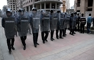
P.C Plod is a good example of how fashion can connate things, he is friendly, quite cute and would probably never arrest anyone. However in real life police can be quite intimidating with their clothing, because they wear so much protective clothing, their belts hold a lot of things that could hurt someone and riot police are even scarier. You can't even see there faces and are like robots, doing what they're told.

Meanings for things don't come from the object, they come from how people perceive things and how society accepts them. Looking at the connotations from cultural objects people can start to understand how culture and meanings work.
Fashion is an obvious sign/code.
For a suit its the CODE for business, professionalism, intelligence etc
- Tie, a pointless invention that has no real use but is a sign for a good career and shows intelligence etc
-A punk challenges that by wearing a shirt and tie in a messy way, undone and not tired properly
There a signs and signifers
A sign is made up of a signifier + signified = sign
Signifier
Written word 'dog'
Spoken word 'dog'
Barking by the dog
picture of the dog
+
Signified
Mental concept of a dog
=
Sign
There isn't a logical relationship between the signifier and signified because people just accept that the letters D O G make the word dog which means a four legged animal, the relationship is arbitrary.
Looking at the picture of the rose, the signifier is flower but the signified is love.
A lot of signified things are stereotypes, especially if it comes to addressing one gender or type of person or genre, by using the appropriate colours or font.
Codes can be used in type as well, when a font is used to try and suggest a genre. If the wrong font is used it looks wrong because what society perceive as the right font is different.
Such as, ;Ye Olde Tea Shoppe' doesn't look right in Veranda.
Denotation is the basic literal understanding of something, like a dog, it is a four legged animal.
Connotation is the associated meanings, it's loyal, companionship or walkies. It goes further than the literal meaning and moves towards an deeper understanding.
Myth
Roland Barthes was literary theorist who looked at codes, signs and mythologies. He believed that Myth works with Connotation, theres a signifier, signified, and a sign in a connotation, the whole sign then becomes a myth with the same pattern as before, there are deeper levels to a myth that people don't unpick which allows it to become a myth.
In this photo the sign is a young black child, he's wearing a uniform and saluting. What's he saluting? Connoted is the French Flag because this was a french magazine and at the time France owned a lot of african land. The myth here is international harmony.

Constable was a very famous artists for painting very english looking paintings, this image shows a natural setting where everything is calm and doing well. In reality painters were commissioned for paintings like this because the gentry who owned the land wanting to depict a tranquil successful life. The people who worked on the land really didn't enjoy it, it was long hours for very little pay so there were marches and upheaval throughout the country.

Font can show cultures and races, such as these. However they can be slightly racist, the Hawaiian type does show Hawaii and a lot of people can relate to that, it suggests that all Hawaiian's use bamboo to makes words and communicate, which obviously isn't the case. The same for the Greek type, it looks like the old markings in stone which is historically correct, but it doesn't mean in this day and age Greek people still use stone to write on.


P.C Plod is a good example of how fashion can connate things, he is friendly, quite cute and would probably never arrest anyone. However in real life police can be quite intimidating with their clothing, because they wear so much protective clothing, their belts hold a lot of things that could hurt someone and riot police are even scarier. You can't even see there faces and are like robots, doing what they're told.


Meanings for things don't come from the object, they come from how people perceive things and how society accepts them. Looking at the connotations from cultural objects people can start to understand how culture and meanings work.
Friday, 11 October 2013
Context of Practice, Lecture Programme
Photography
Mass Observation was a group of men that was founded in 1937 by Tom Harrison, Humphrey Jennings, Charles Madge and Humphrey Spender.
It's obvious by their names they were high class rich men and with the Worktown Project they were interesting in seeing how the other lower class lived. They went to Bolton in 1937 to document the working class.
This was after the Wall Street Crash in 1929, the Great Depression in 1930s, Hitler rising to power in 1933 and the forming of the British Union of Fascists in 1932.
It was a aristocrats view of the working class of Britain but it was not the way the working class wanted portrayed. This image is of an average pub, but it was quite a quick image because the photographer was known to be not working class and had to leave fast! The man who looks like he's waving is really telling him to get out.

Animation
Jiri Trnka, produced The Hand in 1965. This was 20 years after World War Two and Nazism, it was in the height of the Cold War. The state censorship and repession was very strong at the time. Because of this the animation shows that kind of relationship, the repression of a strong hand to this creative man. It is quite a surreal piece but it really communicates how Trnka feels about the Soviet Union.
http://www.youtube.com/watch?v=tLtdCWrpM90
Advertising
Tony Kaye produced the advert for Dunlop Tyres called Tested for the Unexpected in 1993. This advert could be taken either way, is it a piece of art or is it self indulgent piece of film that is surreal and not work with what the advert is trying to sell. Personally I think this advert is ridiculous and didn't need to be so weird, the car shows good grip when the car is cornering, which I think is most important when trying to sell tyres.
Illustration
Norman Rockwell was a very famous American artist, he worked for the Saturday Evening Post. This image so overly stylised, the kids are perfectly well behaved, they've remembered and wish their teacher Mrs Jones a happy birthday while she stands at the front well dressed and looking proper. I think at the time people liked to see these sort of images because american values and good living which some people might not of had. Now that technology has progressed it leads to the question are illustrators needed? A programme like Illustrator can eliminate the middle man, but I think it is important to keep illustrators in business but their hand is unique and create unique pieces.

Graphics
Times New Roman font was designed by Stanley Morison in 1932, England.
Universal Type - proposal was designed by Herbert Bayer around 1925-30, Europe
Fraktur Font was designed in Germany
They were all designed around the same time in the 30's
The English type is reminiscent of Roman inscriptions on stone, which is from the Roman Empire. The font represents the great British Empire, its a nationalist font to probably make people believe in their country again after such a bad time.
The European font is a left wing modernistic font that wanted to bring new solutions to the worrying world. The Sans Serif font stripped of all its historical connotations, they're all lower case because what is the need for upper case? It's very plain and completely neutral which represents the left wing modernist way of thinking, its a unification of socialism.
The German font depicts the power and force that Germany had at the time. It is similar to the English font because of its nationalism and representing their empire.
Wednesday, 9 October 2013
Comparative analysis


To the left is an ultra American advertisement that first went out in 1876. The content of the image makes it look like American propaganda, suggesting that America can feed the world. America is superior to everyone, can fix the problems of other countries like China and Italy that can be seen on the long list the globe is holding. The image to the right also looks like propaganda, it matches the American image well because it too is quite nationalist with the styling and colours. Unfortunately the American advert doesn't work too well, it looks like propaganda but is actually selling a cooking range. Although it may have worked when it came out because the word 'range' was used in the US it definitely misses the mark today, especially in Britain. Whereas with the British propaganda poster, people understand what the 'Great war' was and can understand the message it is trying to communicate, because of the wording.
The American image is very egotistical, at the time America was just turning 100 years old as an independent country and it is clear America thought they were the top of the world, that they could feed the world with this huge cooking range. This sort of confidence can be seen in the British image as well because it was issued in 1915, only a year into the First World War and the government are already calling it the 'Great War'.
They both wanted to appeal to their audiences and one way of doing that is to make whatever the message is look like life will be better if people buy into it. For the American one it is 'if you buy this range you will have a wife who serves you dinner while the slave cooks it, because you will be powerful enough to own a slave, while having the support of an Eagle or America'. With the British one it's more about 'the stories you can tell your kids and how they will look up to you'.
Their audiences are different but similar at the same time, they are different because the American one is just for Americans. It is a very offensive advert, with racist stereotypes on the menu list and the British one is directing it at the British man like him on the poster who has a career and will not fight. They are similar because they are both trying to relate to the wealthy man of the family. The British poster does this with the image of a family man looking straight out at the viewer. Although it looks like the question is being directed at him, his face is directed at the viewer and so is the type. The 'you' is capitalised and underlined to make the viewer ask themselves that question and relate to it.
The American one shows a fantastic image of power, women and slave serving while the man relaxes and shows off what he owns. This kind of idealised image of one man, makes a rich family man relate to and want. Both images look distinctively different with different aims but they both relate to men and use the same kind of imagery to get their message across.
Prospectus Critique
The prospectus for this year is initially quite visually appealing, I like the foiling on the front and it's size, however there are some problems with it I think.
The photos don't really show how good the college is, some of them are stock cliche photos like the box of oil paints. If we wanted to show the Fine Art department off I think we should of showed the space the students use and the aftermath of them creating something.
There is a lot of text which I personally don't like because I know people don't read things like that a lot, it's a busy time looking at so many different Uni's. It needs to be direct and to the point so theres less to read but more to look at.
Some photos look very corporate and don't relay the creative atmosphere that the college holds. I think it would work better seeing people in the studio doing real work and creating things so it would inspire and appeal to students looking to study at LCA.
The photo on the front cover is also risky because of its sexual content, we don't know what people's opinions are about things like that and because its on the cover run the risk of not getting looked at if they are offended it.
Monday, 7 October 2013
Luke Dixon, Salvador Dali, Bloomberg Businessweek, Craig Ward, David Carson
Luke Dixon.
I found this designer through twitter and I really liked his technique, he sells a lot of his prints through tee shirts and jumpers. His use of lines create a lot of texture and shadow which makes the illustrations powerful and interesting to look at. His use of colour is quite confident and sometimes can work very well but on some prints can be a bit too much.


Salvador Dali.
Dali is my all time favourite painter. His surreal compositions are so interesting to look at because of all the different layers and sections to one image. I think the smooth texture of his paintings work so well with his style to make them even more surreal as if everything is normal.


Bloomberg Businessweek.
This magazine has very eye catching and powerful pages that i cant decide i like or not. I think the bold in your face style is good to catch people's eyes, but i don't think it really suits the serious nature of the magazine. A lot of the front pages are very interesting graphic pieces which i think is good to see in a magazine that isn't design lead.


Craig Ward.
This typographer caught my eye straight away, I think the idea behind the 'Bad typography is everywhere' is important and visually communicated very well. I like the fact you can read both sentences and there's repetition and different layers. The piece with the fibres is interesting because it's been manipulated by hand and digitally, which relate well to the actual sentence, played with the fibres but worked hard to make them look legible.


David Carson.
Carson is very well known for his design. I normally go for very precise and neat designs, but looking at Carson's work I know I need to look at different styles and more conceptual work.
I dont really know if I am a fan of Carson's work yet but I'll keep referring to him and looking at more work so I can decide.


Thursday, 3 October 2013
How to, Research


This is the work of Massimo Vignell who is an Italian designer, who was known for having strong views on type, his design of the New York Subway Guide has influenced us when we were going through ideas and concept designs for our own guide.

We also looked at Harry Beck's design for the London underground. The simple and orangised style appealed to us because we knew that would work very well for our map//guide.
Subscribe to:
Comments (Atom)