Chapter Two Plan
The tactics of design
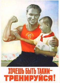
Identity – Russia - Red, bold, sans serif,
images of leaders
America – Red and blue, the
fear of communism
British – browns, natural
colours, the people in it
Tone – Russia – powerful, direct
America – Fear of communism, the
threat was big
British – Question, get the
people involved
Message – Russia – Communism is great
America – The threat is
real and is scary
British – Everyone
needs to be clever and help
Timeline of identity.
Beginning of rev – full of action. Russia.
Warmed down and became censored.
Fake images of Russia.
This chapter is where the triangulation will mainly take place. It concentrates on the three big powers of the time, America, Britain and Russia. Comparing the propaganda means that I will get a good understanding of the techniques used. I will understand the target audience, the message, the way they convey the message, the reality of the propaganda and tone of voice.
Looking at Cold War propaganda mainly, due to moving along the timeline. The Cold War was when propaganda was most important because of the threat of Communism. It was a terrifying idea for westerners, so there was quite a lot of material created.


No comments:
Post a Comment