


I just played around with layout options here, I wanted one side to be just text, and on the other side have the corresponding artwork to go with as a visual. I also think if the book is set up with all images on the outside it will look really good.
The colours I have used are red orange and black. The colours of constructivism.


Although it does look like the German flag, I've only used it a little bit so it doesn't confuse people. The colours of Russia, Blue and white really don't suit this.
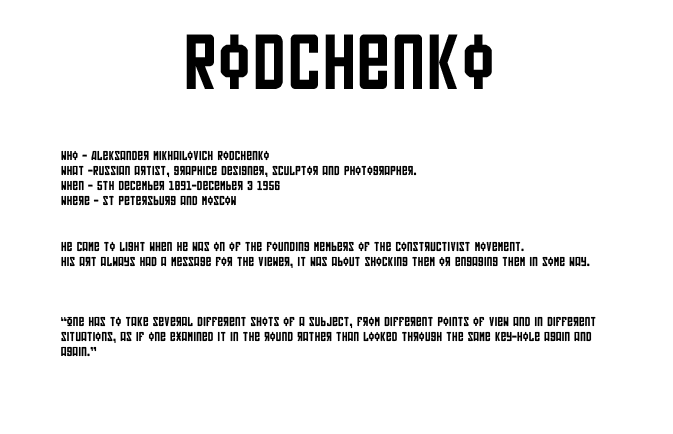
For type I wanted to use an obviously Russian typeface to make it obvious what this book is about. The content is quite confusing so being able to relay information through type is easier.
I think this looks really good, its a strong clean typeface and really is appropriate for the content. For body text I've simply used Time Roman, because the sans serif make it easy to read, and relates to the history of the topic.
I chose to centre all the information because I think it suits it that way since the panel is landscape.
No comments:
Post a Comment